The meaning of colors in psychology
Choosing the right tone contributes to various effects and can even guarantee success in various endeavors (at work, dating, meeting important people, etc.).
Understanding what certain shades and combinations carry, it will be easier for each person to navigate and even direct the course of events in the right direction. You can understand your condition, see changes in your friends and acquaintances, help improve your mood, and much more by correctly selecting and combining certain colors in your style and environment (items on your desktop, home interior, etc.).
Experts have proven that certain events or memories are directly related to one color or another. Almost everyone associates various holidays and events with bright colors such as red, orange, green, pink, yellow, etc. Sad events always have a black or gray tone.
Subconsciously, people perceive and react to colors in a similar way. Since childhood, a person gets used to perceiving red as a warning sign, prohibition and anxiety. Green, on the contrary, allows you to perform desired actions, confidently move forward, without feeling danger. Each of them has its own characteristics, affecting the perception and psychological state of a person in different ways.
Human color perception
Psychologists say that color has an impact on a person's emotions and can affect mood. Also, under the influence of color vibrations, a person can make certain choices without even realizing the reasons for his actions. Color effects on the psyche have long been used in treatment, marketing and politics. By studying the influence of color vibrations on a person, you can change your life in many ways.
Find out what awaits you today - Horoscope for today for all zodiac signs
Due to numerous requests from subscribers, we have prepared an accurate horoscope application for mobile phones. Forecasts will arrive for your zodiac sign every morning - it's impossible to miss! Download for free: Daily Horoscope 2020 (available on Android)
Each color tone has subconscious associations; it affects the perception of the individual, as does the volume of objects. Color vibrations can soothe and excite, attract and repel. Subdued shades in the color palette have a calming effect and promote reflection and creativity.
Note! Color vibrations are absorbed 80% by nerve fibers and only 20% by the organs of vision.
Using color vibrations you can:
- evoke warm or cold feelings;
- achieve the desired psychological state;
- convey the mood of a certain season of the year;
- touch sensations and feelings.
Color vibrations actively affect human physiology and psyche and can change mood and general condition. For example, the color red is subconsciously perceived as anxiety or prohibition, while green symbolizes safety. Therefore, exactly these colors are present in a traffic light, because a person perceives them on an intuitive/subconscious level.
Purple color in psychology
By combining red and blue, you get purple. Deciphering this shade has certain difficulties and several nuances. Most artists in ancient times painted pregnant girls using this shade of the palette. This phenomenon is explained by its consonance with sensuality.
In the modern world, experts claim that it has a negative and even depressive effect on humans. Most self-critical, gloomy, dissatisfied individuals with life prefer to surround themselves with purple objects and clothes. By using it in small quantities you can get benefits, because purple increases self-esteem. It is worth noting that this color is not used when working with elderly people and small children.
Color perception - how does it function?
Color perception is one of the functions of vision, thanks to which a person perceives the world in all its variety of colors and shades. The refractive system of the eye and the retina, on which light rays are collected after refraction by the lens and cornea, are responsible for image formation. The color of the picture is determined by the central point of the retina - the macula, or more precisely, the cones. These photoreceptors provide color vision and are involved in photopic (daytime) vision.
There are three primary colors in nature: red, green, blue. The entire variety of shades, of which there are several tens of thousands, is formed by mixing these three main tones. This theory was put forward by Lomonosov in 1756. T. Jung conducted his research in the same direction. Subsequently, the idea of three-component color perception was supplemented by G. Helmholtz and his students. There are three types of cones, each containing a specific pigment. In other words, the macula contains blue, red and green cones. In this case, color waves, regardless of their length (spectrum), immediately affect the entire cone apparatus. If there are any defects in it, the color perception will be incorrect. In this case, we are talking about color vision disorders. They are caused by pathologies of the optic nerve, retina, and nervous system.
Color vision disorders are rare. Approximately 8% of all men have congenital impairments of this visual function, but this does not mean that they cannot distinguish colors at all. In most cases, one of the spectra is not available to them. In women, problems with color perception are even less common (approximately 0.5% of cases). Color vision disorders can create some difficulties when choosing an activity. Information is often presented in the form of color signals - in transport, industry, agriculture and other areas.
Blue color in psychology
The blue option is preferred by many people. This happens due to tangible magnetism. It is when contemplating deep blue things that a person tends to immerse himself in thought, to reflect on the meaning of life and the eternal. In films and stories, magicians are depicted in blue robes. Buddha and Krishna are blue in color, which speaks of wisdom and inner harmony.
Most often, this option is preferred by purposeful, selfless people with personal views and point of view. Clothing in similar colors exudes austerity, high spirituality and a serious position in life. Blue has a beneficial effect on the nervous system, has calming properties and extinguishes excessive passion.
How can you make a color “good”?
So, it was previously noted that human perception of colors is subjective. Everyone can see different shades, associating them with good or bad emotions. But at the same time, almost any color can be made positive. When choosing a shade, consider three factors: appropriateness, aesthetics, and meaning. The meaning of color was discussed above. As for relevance, everything is quite simple here. For example, it is better to choose a brown table rather than a blue one. Aesthetics is a more complex factor. It is important to rely on good taste here. When decorating an apartment or office, or selecting clothes, take into account the opinions of designers, stylists and other specialists in this matter.
Color therapy is not a science, but a teaching, one of the methods of treatment. However, it cannot be template. Psychologists are constantly studying the problem of human perception of color. On the one hand, you yourself can try to determine how this or that shade affects your mood. On the other hand, there are no absolute laws. Preferences may change over the course of a lifetime.
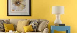
Yellow color in psychology
This color is one of the brightest and most positive. The color of summer, sun and warmth has a positive effect on brain activity, improves mood and makes the imagination work. Of course, excessive use of yellow shades in clothing and interior design can lead to overstimulation. In the interior it must be harmoniously combined with darker and soothing tones.
Positive and talented individuals prefer yellow. Those who have a huge amount of ideas and talents. Purposeful, positive people who are able to adapt to their interlocutor. In addition to all these positive characteristics, yellow has a second side to the coin. It is he who is considered a symbol of dementia and madness.
What's inside?
What happens in the body itself when we see any color? How does our brain react to the colors of the world around us? It turns out that the outer segments of the rods of the retina of humans, marine invertebrates, fish and almost all terrestrial vertebrates contain a basic visual pigment called rhodopsin. It is also called visual purple because it becomes purple in color after absorbing green or blue light.
See also: “Visual rhodopsin is a receptor that responds to light” [8].
Rhodopsin best absorbs light wavelengths of 500 nm, while the absorption of color-sensitive cone pigments of various types occurs in the region of 420 nm (blue light), 531 nm (green) and 558 nm (red). When light is absorbed, the conformation of the protein part of rhodopsin changes, and it activates the G-protein transducin, which triggers the enzyme cGMP phosphodiesterase. As a result, the concentration of cGMP in the cell drops and sodium channels close. As sodium ions are constantly pumped out of the cell by ATPase, their concentration within the cell rapidly drops, causing hyperpolarization of the visual membrane. As a result, the photoreceptor releases less of the inhibitory transmitter glutamate, and nerve impulses arise in the bipolar nerve cell, which is “disinhibited.”
See also: “Receptors in active form” [9].
This is why colors with longer wavelengths have the greatest impact. For example, red has the longest wavelength. An exciting, warming, active and energetic color, it penetrates and activates all body functions: stimulates nerve centers, energizes muscles.
Of course, many epithets here should be taken purely figuratively. - Ed.
Blue color, on the contrary, has the shortest wavelength - therefore it calms and slows down the body's nervous system. Recommended in therapy for emotional and nervous people, however long-term exposure to blue can lead to depression.
Green color in psychology
Green is a symbol of spring, rebirth and peace of mind. The healing and relaxing properties have long been proven. Prolonged contemplation of green brings with it absent-mindedness and boredom.
Lovers of the green palette have balance, efficiency, internal harmony and the ability to logically assess the situation. Green extinguishes the negative effects of depressive and negative colors. That is why it is combined with dark depressive tones (purple, black, etc.) creating ideal clothes and interiors.
Red color in psychology
A victorious color characterized by excessive activity, determination, rigidity and even aggressiveness. It is also red that is associated with passion, love and self-sacrifice. It is most often used in marketing concepts (posters, advertising, etc.) and in danger warning signs (road, traffic lights). Experts do not recommend getting carried away and looking at the red color of the palette for a long time.
People who sympathize with red have a strong character, obvious courage and determination. Passion, impulsiveness, power and perseverance can play both to the benefit and to the detriment of a person.
Orange color in psychology
Orange is pretty close to yellow. It has similar features and properties. Cheerfulness, positive attitude, passion, readiness to solve complex problems, joy and spontaneity - all this is conveyed by this version of the palette. Orange has a positive effect on a person and lifts him out of a depressed state after heavy losses and disappointments. Included in the list of the best flowers for psychotherapy.
Lovers of this color have forgiving, easy-going, bright character traits. It is worth considering that their characteristic is inconstancy and arrogance.
Why is it worth growing flowers at home?
The presence of indoor plants has a beneficial effect on the air quality in the apartment. Modern housing is filled with things made of synthetic materials and plastic, furniture made of chipboard. They release chemicals into the air that are harmful to our health. Flowers have the ability to absorb these dangerous particles, purify the air, and saturate it with oxygen. That is why in a modern metropolis, growing them is not just desirable, but necessary. Ficus, ferns, and indoor varieties of palm trees can serve as excellent air purifiers. Cacti are known for their ability to absorb ionizing radiation, so they are often placed near the computer and TV. Chlorophytum destroys bacteria and disinfects the air. Flowers also help maintain optimal humidity in the room, which is especially important in winter, when heating can cause the air to become dry.
Lilac color in psychology
The color lilac is a symbol of affection and warm feelings. It evokes philosophical views on life, peace of mind and the feeling of flight.
Lilac lovers are very romantic, sentimental, dreamy, romantic and sensual people. Despite their gentle nature, they have impeccable mental abilities and excellent ingenuity. Attentive attitude to one’s appearance and to the appearance of others, readiness to help is another quality inherent in “lilac” people.
White color in psychology
Purity, innocence and exceptionally light associations are carried by white tones. New beginnings, a symbol of freedom, inspiration, peace and faith.
Medical workers wear white coats. This is due to the color's associations with goodness, honesty and perfection. In many countries, this color is present in traditional attire. It is impossible to accurately reveal the character of white lovers, since it is widely used as work clothes. It looks impressive in combination with other color options and is a classic option.
Literature
- Andreeva I. (2007). Global advertising: rules of good manners. There are colors all around. "CompuArt". 11;
- Goethe I.V. To the doctrine of color. Chromatics. Essay on the doctrine of color. Moscow, 1957;
- Koryakin K. (2008). Color and packaging: how to achieve effective communication with the consumer. "Unipak.Ru";
- Mukhina V.S. Age-related psychology. M.: "Academy", 2006. - 608 pp.;
- Petrenko V.F. (1998). The relationship between emotions and color. “Bulletin of Moscow University. Psychology series". 3;
- Sobchik L.N. The color selection method is a modification of the Luscher eight-color test. Practical guide. St. Petersburg: “Rech”, 2007;
- Neuroeconomics. (2011). nature-wonder;
- Visual rhodopsin is a receptor that responds to light;
- Receptors in active form.
Gray color in psychology
A mixture of completely opposite colors (black and white) carries a neutral feeling. The “golden mean” is mostly ignored by people and is associated with workdays and everyday life. Despite the fact that few people pay attention to the color gray, it conveys friendliness, calmness, stability, realism and common sense.
A small percentage of those who prefer gray are friendly, courteous and patient by nature. Preferring and surrounding oneself with gray tones indicates a person’s emotional exhaustion and nervousness.
Characteristics of warm shades
Let's consider warm shades of color, which include:
- red;
- burgundy;
- orange;
- yellow;
- brown;
- grey.
Red tint
In psychology, the color red is characterized as aggressive and even threatening: it is associated with cruelty and bloodshed. This color is also associated with passion and self-sacrifice. This shade is also associated with activity and determination, warmth and brightness. The scarlet tone is perceived as exciting, dark red gives solidity.
In healing, red is used to improve blood circulation, stimulate nervous activity and enhance libido.
Psychologists do not recommend looking at the color red for a long time, as it can cause mental overstimulation and aggression. However, in moderate quantities, red helps to cope with loss more easily, gives confidence in the future and hope for a better future.
The red hue is liked by strong personalities, courageous and purposeful people. He does not frighten them with his aggressiveness, but fills them with a feeling of comfort.
Burgundy shade
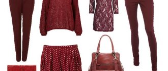
This color is preferred by respectable business people, conservative and self-confident individuals. The color is formed from the fusion of red and brown tones. In its semantic meaning, this shade denotes power and strength. Therefore, burgundy-colored clothes are chosen by assertive and purposeful people. They are not characterized by open expression of emotions, but they show organizational skills.
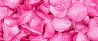
Pink shade
The color pink is associated with childhood, youth and innocence. It is also the color of lovers, dreamers and romantics. Lovers of pink are distinguished by their devotion and hard work. They are childishly naive, good-natured, touchy and whiny.
Yellow tint
It is a symbol of divine power, solar energy and gold. In psychology, the color yellow carries the semantic meaning of a warm, joyful, bright and light shade. It evokes joyful and bright emotions, fills the soul with happiness and fun, activates mental activity and causes pleasant sensations.
Note! Warm shades of yellow symbolize marital fidelity, while cool shades symbolize betrayal and jealousy.
Application of yellow:
- memory improvement;
- improved concentration;
- relieving depression, despondency;
- liberation from negative energies;
- making smart decisions.
In psychology, the yellow tone is used to work with children; it activates attention and helps better assimilate knowledge. However, an excess of yellow has a stimulating effect, so moderation should be observed in children's rooms.
Orange tint
This color is close in its vibrations to the yellow tone. In psychology, the color orange carries the meaning of joy, optimism, positive emotions and readiness for action. The orange tone frees you from depression and makes you forget about losses and disappointments. This color is often used in psychotherapy to treat depression.
Application of orange:
- relieving depression;
- disclosure of the emotional sphere;
- improved mood;
- restoration of nervous energy;
- feeling of fun and well-being.
The orange shade attracts people with a light character, easygoing and sociable. However, negative character traits include arrogance and arrogance.
Brown shade
This color is associated with stability and hard work, dedication and business. However, this shade can be perceived as uncertainty and doubt. Brown color is liked by cheerful people, hardworking and decent people. They have an optimistic worldview, but at the same time they are reasonable and rational.
Gray shade
This color comes from a combination of black and white and evokes a neutral feeling. It is associated with gray everyday life and routine, boredom and everyday life. However, the gray tone carries vibrations of mutual understanding and calm, sanity and stability. This color is liked by polite and friendly people, calm and responsible.
Characteristics of gray:
- sedateness;
- old age;
- modesty;
- sadness;
- intelligence;
- completeness;
- conservatism;
- practicality;
- hardness.
However, the desire to surround yourself with things of a gray shade speaks of nervous tension and emotional exhaustion.
Psychology of color in clothing
For business meetings and promotion at work, formal outfits in blue, light blue, brown, and gray are ideal. Combinations of white flowers with black also have a positive effect.
Meeting with friends and relatives, walks in the park, around the city require brighter and richer colors, especially if it is a warm period of time. Clothing in green, yellow, turquoise, lilac, and orange tones cannot be ignored and left hanging in the closet.
For a date or a romantic dinner, the fairer sex quite often resorts to outfits with red accents and elements. This move ignites passion and has an exciting effect on partners.
Coloristics. Brown color
- Colombia: sales obstacle
- Australian Aboriginals: earth colors, ceremonial ocher
- Feng Shui: Yang, Earth, Industry
- Christianity: Spiritual Death
- Islam: death, decay
This is the color of the earth, associated with earthiness, with the rooting of everyday life. And in Christian symbolism it means spiritual death. The Koran associates the functions of death and decay with the color brown.
Psychology of color in the interior
Bright shades (yellow, orange, green, red) are most often used when decorating a kitchen. Furniture in these colors helps increase appetite and improve mood.
Blue, violet and cyan are actively used in bathrooms.
It is not advisable to use blue, purple and white colors in children's rooms. It is best to organize children's rooms in pink, peach and other warm colors.
Very often, public institutions (cafes, restaurants, hotels) resort to decorating their premises using brown and red shades.
Coloristics. Psychophysical characteristics of color
Coloristics. Color tone
This is the quality of a color that allows it to be compared with one of the spectral or magenta colors (other than chromatic) and given a name.
Coloristics. Lightness
This is the degree of difference of a given color from black. It is measured by the number of thresholds of difference from a given color to black. The lighter the color, the higher its lightness. In practice, it is customary to replace this concept with the concept of “brightness”.
Coloristics. Saturation
This is the degree of difference between a given chromatic color and an achromatic light flux that is uniform in energy saturation. It is also measured by the number of thresholds of difference from color to gray. (We can also say that this is the proportion of pigments in the original pure color). Replaced by the concept of purity. Purity is the proportion of pure spectral color in the total mixture of a given color or it is the proportion of pure pigment in a paint mixture.
Hue + Saturation = Chroma
Achromatic colors have no hue or saturation.
Coloristics. Color temperature
This is its relative warmth or coldness.
- Warm: Red, Red-Orange, Orange, Yellow-Orange, Yellow, Yellow-Green.
- Cool: Blue (Blue-Green), Blue, Blue-Violet, Violet.
- Hottest: Red-Orange.
- Coolest: Blue (Blue-Green).
- Neutral (Green and Purple).
