|
Dear blog visitor!
I have prepared a gift for you - “Problem Solving Practices”, which will help you learn how to get answers to your questions and find the best way out of the current situation.
Pick up your gift using this link >>>
Colors affect a person’s health and psychological state. Flowers can be used to change your mood. Color schemes in clothing are very important, because... in direct contact with the body, they directly act on it.
The influence of color on a person
Color therapy has been known since ancient times. Colors can excite the nervous system or calm it. They can inspire or relax, help you fall asleep faster or, conversely, activate the nervous system.
Each color stimulates different parts of the brain that are responsible for different functions. Colors can turn a pessimist into an optimist and vice versa, if they are constantly present in the appropriate rooms. Thus, you can even influence a person’s character.
Features of color therapy
Color therapy, or chromotherapy, is used to correct mental conditions and treat disorders. Subconsciously, every person resorts to this technology when choosing a wardrobe or interior. But the professional use of psychotherapy helps reduce anxiety, get rid of depression, increase self-confidence and improve overall quality of life.
The specificity of the influence of color depends on its wavelength. Short and long waves affect different parts of the brain.
Long-wave warm shades invigorate, short-wave (cold) shades inhibit mental activity.
Color therapy is the most accessible method of psychological correction. Knowing how color affects a person’s emotional state and well-being, you can independently apply this in practice. For example, choose a wardrobe that matches your energy, change the curtains in the house, buy colored bath bombs. A combination of color therapy and art therapy will have a special effect.
The effect of white color
This is a symbol of purity, truth, innocence and Higher Divine powers.
It creates solemnity, provides moral support, gives a boost of energy and brings peace. White color helps improve the condition in cloudy weather, maintains skin moisture, and is involved in the functioning of the endocrine system. It helps to cope with emotions, creates sophistication and elegance. This color plays an important role in color therapy. White helps remove negative energies and tune into pure consciousness. It helps to expand consciousness and purify it. It has a pronounced antimicrobial effect.
At the same time, an excess of white in a room can have a bad effect on work activity, it can give a feeling of disappointment and devastation.
The influence of black
This is an ambiguous color.
It symbolizes impurity, death, transition to another world, sadness, secrecy, it is a symbol of mystery. At the same time, it calms and reduces tension. It is a symbol of great potential and strength. Black color is often loved by people who are irreconcilable with external circumstances, who have a lot of information and hide it.
This color combines calm and storm. When combined with other colors, black reveals different properties.
Black underwear attracts illnesses and problems in life, creates an imbalance in energy centers (because it does not match their colors).
It is also not recommended to wear black clothing except for business meetings, where it helps to concentrate.
The influence of red
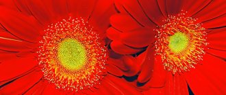
Red color increases activity and has stimulating properties.
This is a warm color that creates a feeling of warmth, activates metabolism, increases blood pressure, and stimulates the brain. However, an excess of red or its prolonged effect, after activation and excitement, begins to depress, irritate the nervous system and leads to fatigue. This color irritates children especially quickly.
On the one hand, it is the color of life and fire, on the other hand, it is an aspect of pride and selfishness. It is a symbol of courage and victory, struggle and cruelty. This is an animal color. Therefore, the muladhara chakra is red. After all, she is responsible for the animal qualities of a person.
is not for irritable and angry people .
Harmonic combinations
To more fully explore the topic of harmonious color combinations, we will have to give several academic definitions.
Harmony is a philosophical and aesthetic category, meaning integrity, unity, natural coherence of all parts and elements of form, that is, it is a high level of orderliness of diversity and the correspondence of parts within the whole, meeting the aesthetic criteria of perfection and beauty.
Color harmony is a combination of individual colors or sets of colors that form an organic whole and evoke an aesthetic experience.
Color harmony in design is a certain combination of colors, taking into account all their main characteristics, such as:
- Color tone;
- lightness;
- saturation;
- form;
- the dimensions occupied by these colors on a plane, their relative arrangement in space, which leads to color unity and has the most favorable aesthetic effect on a person.
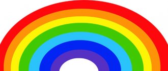
Color circle
Signs of color harmony
1) Connection and smoothness - a connecting factor can be: monochrome, achromaticity, unifying mixtures or patinas (a mixture of white, gray, black), a shift to some color tone, gamma;
2) unity of opposites, or contrast. Types of contrast: by brightness (dark-light, black and white, etc.), by saturation (pure and mixed), by color tone (additional or contrasting combinations);
3) measure - in a composition brought to harmony, there is nothing to add and nothing to remove from it;
4) proportionality, or the relationship of parts (objects) between themselves and the whole. In gamma, this is a similar relationship between brightness, saturation and color tones. Let's consider the ratio of the areas of color spots:
- 1 part light field - 34 parts dark field;
- 1 part pure color - 45 parts muted;
- 1 part chromatic - 34 parts achromatic;
5) balance - the colors in the composition must be balanced;
6) clarity and ease of perception;
7) beautiful, the desire for beauty. Psychologically negative colors and dissonances are unacceptable;
 sublime, that is, the ideal combination of colors;
9) organization, order and rationality.
Blue and red colors do not so much align each other as they are opposites. When the intensity of blue is weakened and it turns into a grayish blue, special qualities of their color sound arise. If you give a red or orange-red color an earthy tint and turn it into a terracotta color, then when compared with a grayish blue, this combination usually causes a lasting positive emotion. The orange-red color and its variations themselves impart warmth, while the blue color conveys coldness, so both colors together are perceived optically as extremely positive. We can say that here a wonderful impression of dynamics arises, which is in tune with our internal activity.
In practice, using pure opposite colors is not always possible. The exceptions are orange and blue, the combination of which is perceived positively.
Just as in nature, shapes are observed that only approach a circle, triangle, quadrangle, etc. (even in the dead kingdom of crystals strictly mathematical relationships are rare), and in the play of color approximately opposite colors are allowed.
Adjacent colors
By adjacent we mean colors that are associated with a specific color on the color wheel through psychological family relationships. These are not only those colors that, purely theoretically, are 30, 60, 90 or even 120° away from the given one.
Combinations of adjacent colors highlight the functions of a particular color. While opposite colors reinforce each other, adjacent colors, due to their sequence in time or mutual comparison, receive dynamic development.
The combination of blue and green will have less contrast than yellow and red because contrasting passive colors have less psychological impact than active ones. A characteristic impression is created by the combination of blue and green with a gradual transition from blue to green.
Apricot and soft green (the color of a fresh green leaf) express the theme of maturity. The contrast to yellow or tan is pure blue. Orange and green colors complement each other perfectly.
Yellow occupies a middle position on the color wheel between green and orange. A person who has no idea about the color wheel unconsciously looks for a middle color that softens the contrast between green and orange, that is, yellow. Yellow color is without a doubt psychologically more effective than, for example, turquoise as a middle color between blue and green. This is why the combination of blue and green is not as active as the combination of orange and green.
Turquoise is neither blue nor green, it does not have its own quality like yellow. The yellow color is significantly different from red and green, but, when compared with one color or another, it gives part of its radiance to the color compared with it; It turns red into orange, and green makes it warmer. Turquoise can, at best, enhance the cool color impression of both green and blue.
Orange is located between red and yellow on the color wheel. A drawing done in red and yellow colors “sounds” loudly and excitingly. The desired middle color is orange, which gives warmth, but is unlikely to enhance the already existing joyful situation. Orange between yellow and red does not reduce tension, like yellow between orange and green.
So, adjacent colors can be used to give the space more expressiveness. In one case, these colors are attractive because each of them, compared to the adjacent one, is viewed in a new way. Thus, red, when compared with orange-yellow, seems thicker, orange-yellow, when compared with red, seems to brighten, green, compared to yellow, seems earthy, yellow next to green radiates into space and creates a mood of carefree.
Golden and blue-violet colors express solemnity and festivity, because the intermediate color is purple-red. In turn, in relation to purple-red, the contrasting color is green, which, under the influence of purple, also becomes festive and solemn. When combining the polar colors lemon yellow and blue, green, being an intermediate color, weakens tension at both poles. But since complete reconciliation of these polar partners is only desirable, but does not actually occur, this combination of colors does not have a static character and remains dynamic.
Which colors to choose as the initial ones depends on personal taste or on the color of those elements that will dominate the composition.
Orange effect
This is the color of joy and fun.
It creates a good mood, breaks down barriers and gives freedom of action. It has a good effect on concentration. Its qualities are similar to the color red, but without the irritating effects. It is a symbol of courage and adventure and creates a feeling of warmth. Orange color helps restore broken connections in the body. It is useful to use for diseases of bones, tendons and joints. It has the ability to restore hormonal balance and cause a feeling of euphoria.
If in excess, orange can cause irritation.
History of color therapy
Color therapy was first used in ancient times. For example, healers colored water or stones with herbs to improve a person’s well-being. For hepatitis, patients were advised to wear yellow beads, and skin infections were covered with a red cloth.
Modern medicine views such methods with skepticism. But psychology knows for sure: color affects the perception, mood and psyche of a person. Psychodiagnostics even uses a special Luscher color test, which allows you to determine not only a person’s state and mood, but also stable personality traits, abilities, causes of stress, likes and dislikes.
The influence of yellow
Yellow color stimulates appetite.
The Manipura chakra, associated with digestion, is also yellow in color. If you have stomach or digestive problems, eat from yellow dishes. This color tones the nervous system and activates mental abilities. Well suited for designing student rooms.
Yellow color symbolizes joy and warmth, well-being and prosperity. It helps you get through difficulties and gives you clarity of thought.
Yellow helps in cleansing the body and getting rid of waste and toxins. Promotes renewal and rejuvenation of the body. It stimulates memory and has a beneficial effect on creativity.
What is color psychology and how is it used?
Color psychology studies the mental and emotional effects that colors have on people. It describes individual characteristics as well as common impacts.
Certified practicing psychologist, founder of the center for the popularization of practical psychology Vadim Kurkin talks, for example, about the following effects:
- Warm colors (red, yellow, orange) are associated with a variety of emotions. This can range from a feeling of comfort and joy to hostility or anger.
- Cool colors (green, blue, purple) evoke calmness or sadness.
Knowledge of color psychology is applied in various aspects.
Color in interior design and clothing selection
The psychology of color is relevant for designers who are planning renovations and choosing a range to decorate certain rooms. Calm, cold tones are recommended for bedrooms, and bright colors are used to decorate living rooms and kitchens. The color scheme is important when decorating offices and workspaces.
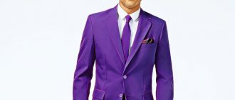
Knowledge of color psychology helps in creating a wardrobe and choosing clothes for different events. The brighter the color and the more contrasting the tones, the faster you will find yourself in the center of attention; cold tones will make you inconspicuous.
Diagnosis of psychological state
Magic of color: Freepick
The Luscher color test is used to assess a person’s psycho-emotional state. He is well known to psychiatrists and psychologists, marriage counselors, criminologists, doctors and recruitment agents:
- The full version of the test has seven tables and 73 colored fields. There is a simplified version with eight colors.
- During the test, a person sequentially selects colors from the most to the least pleasant.
- Based on the choice, they draw conclusions about the mental and sometimes physical state of a person, the characteristics of his behavior, fears, inclinations, and relationships to the world around him.
Psychology of color in advertising and marketing
Different colors can make a person feel hungry, stimulate positive or negative emotions, instill confidence, a sense of calm, or stimulate activity. The shade of the packaging and the product itself is of great importance to the buyer, even if he does not think about it.
Even the color of the tablets affects their effectiveness. Therefore, modern marketers take into account the specific color scheme of products.
The influence of green
It is a symbol of harmony, calm and balance, helping to tune in to nature.
Anahata chakra is green. This color symbolizes love and unity. It is used in healing. At the physical level, it dilates blood vessels, helps lower blood pressure, is used for liver disease, reduces headaches, and has analgesic properties. Green color has a beneficial effect on the nervous system, helps with insomnia, has a good effect on concentration, and gives rest to the mind. Sometimes dark shades of green can lead to depression.
Symbolism
Traditionally, the psychology of red color is rooted in the cultural traditions of ancient peoples. In different parts of the world, people gave it similar meanings:
- Danger warning. Red is similar to blood, so seeing this color, people feel fear and subconsciously avoid it.
- Sacred sacrifice. Red wine in Christianity symbolizes the blood of Christ. By drinking wine, a person touches the divine, expresses his reverence and respect for his sacrifice.
- Hypertrophied femininity. The ancient Slavs considered red a symbol of the rebirth of a girl into a woman, so the wedding dress was not white, but bright scarlet.
Red is rare in wildlife, so it immediately attracts attention. Proper use of color helps to properly influence your life and influence those around you.
The influence of blue
This color helps to reach a new level of perception and has a calming effect.
It gives access to new worlds. The third eye chakra is blue. This is the chakra of intuition and access to information fields. Blue color helps the endocrine system and is used in the treatment of the spine, spinal cord, diseases of the thyroid gland, kidneys and eyes. Helps cope with insomnia and headaches.
An excess of blue can lead to intransigence, misunderstanding of the situation, conservatism and fatalism.
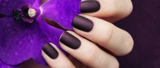
The influence of purple
This is the color of prosperity and luxury.
On a subtle level, it personifies spirituality, mysticism, and creativity. Purple color helps to cope with doubts and fears. This color is used by highly spiritual people. It helps you gain power over your life, expands your consciousness, gives inspiration, and strengthens your intuition. If a person has a strong spirit, this color will help him.
This color helps with diseases of the central nervous system, skin diseases, reduces heart rate, and has a beneficial effect on the immune system.
A large amount of purple can cause a feeling of heaviness and sadness, and depression can also occur.
The influence of color on a person does not play a key role, but it has a fairly strong impact on him.
Choose colors that are harmonious for yourself and be happy!
| Author of the article, Lyubomir Borisov |
My page in VK >>> Instagram >>> YouTube channel >>>
.
Use of red in official medicine
In ancient China and India, healers noticed that when there were specific diseases, different people liked the same colors. They believed that in this way the human body strives to heal and began to use the energy of color in their practice. With the development of medicine, this method was recognized as charlatan.
But when the influence of red energy was proven by modern representatives of official medicine, it began to be used as a means of additional therapy. Infrared radiation is used to alleviate the condition of patients with various pathologies.
Exposure to red is necessary for the normal mental development of children. It should be used in doses and only in the first half of the day.
I liked the article, subscribe to the most interesting and useful materials on the topic >>>
FIND THE INFORMATION YOU ARE INTERESTED BY THIS LINK >>>
Dear friends, I have prepared for you a practical guide, which includes dozens of the most effective techniques and practices for:
brain development, sensitivity to energy, solving health problems, gaining the skill of working with the energy of love , relieving psychological problems and mastering methods of changing fate.
All practices have been personally tested, and they have all shown to be highly effective!
Go to the practical guide page >>>
Learn to control your destiny, fulfill your dreams and achieve your goals in 30 days.
Character traits
The choice of color can say a lot about a person's personality, in particular about a person's character traits. Positive qualities include:
- Strength of will. Such people do not retreat from difficulties and endure difficult moments in life more easily than others.
- Energy. Those who love the brightest colors are always full of energy with which they can charge those around them.
- High sexual activity. Both women and men have increased libido activity and have a varied sex life. But in some cases, excessive activity can lead to promiscuity.
- Determination. Most red lovers are leaders by nature; they easily organize people and lead them.
Negative traits include:
- Cruelty. In people with a tendency towards sadism, red can cause attacks of cruelty towards those who are unable to resist: children, pets, subordinates.
- Stubbornness. Excessive persistence can turn into the need to achieve a goal at any cost.
- Intolerance. It is difficult for such people to compromise; they insist on their opinion even when they understand that they are harming themselves.
- Violence. It can manifest itself in the form of both verbal aggression and physical violence.
Love for the color red in itself is not an indicator of any character traits, but complements the psychological portrait in general diagnostics.
